I chose a knight as the piece to use because it's arguably the most illustrative of all the chess pieces and is asymmetrical, which makes it more of a symbol and less of a badge.
Whilst it followed their instructions it ended up looking very corporate and clearly wasn't suitable for a band at all, especially given that they really like The Ramones logo, which is very different to the above mock-ups.
It was a bit frustrating that their guidance led in the complete opposite direction to where they actually wanted to go, so I told them to leave it with me a couple of days and I'd send them something back that was more suitable. I rang my friend to tell her I'd had some ideas and asked if her housemate was available to talk about them. I sent the below screenshot to my friend and started talking to Harri, the lead singer of the band via text message.
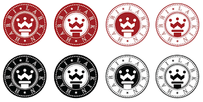
I used the knight symbol in a badge-like design that's clearly been influenced by The Ramones logo to make it more suitable for the band. I also used a symbol for the queen in chess as well, as it draws less comparisons with banks than the horse and so feels less corporate. I tried to use more whitespace to try and keep it slightly more feminine than The Ramones logo though.
Unfortunately by this point the person who's doing the artwork for the band's first album had offered to do a logo as well, but Harri liked these a lot and asked if she could use them as stickers, and potentially as the logo if she and the band liked them more than the other proposed logo.
Harri particularly liked the top right one and asked to see how it'd look in two colours, black and a dark red. I feel it looses something when in two colours, as shown below.

To try and avoid the band picking one that was sub-par I did the below variations too, which I think all look better than the 2 colour ones.

I set up the ones they wanted to use for stickers in the way for them with bleed and crop marks as the website they were using required as Harri wasn't comfortable doing it herself.


No comments:
Post a Comment